According to Simon Rogers, data journalists are ought to fulfil one of the most important roles of theirs – bring data to life. Data can serve as an argument within the story, making it trustworthy. What is more, processed data can explain the issue in a clear manner where words do not need to take place. Hence, it is important to find the balance between story itself and data. This can be pretty challenging as it depends on the case. Some people might be bored with reading a long article or get scared seeing statistical outputs, even so, every reader is different and there is not perfect article for everyone. Although, it is always a way to present a story in an appealing way where text does not bore you and numbers do not bite. Simon Rogers, data journalist and data editor at Twitter, once stated:
“Data journalism is not graphics and visualisations. It’s about telling the story in the best way possible.” – Simon Rogers
Taking into account this thought, we can assume, that there is no firm template in terms of proportions text versus data or how exactly use data in different cases. It’s all about the story and the best way to tell it. Do’s and don’t’s can serve as an example, when it comes to choosing what kind of output data journalist wants to produce.
Do’s
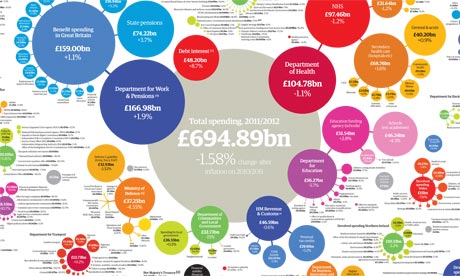
Data Journalism Handbook states that data is a growing value. It can be used to make deeper insights, present bigger picture and reach bigger audience. Therefore, if there is an opportunity to supplement the story with data – take this chance. It will become presentable and trustworthy story. Although, it is wise to verify data, whether it is correct one or false. It can be done by using verification check-list (discussed in Verification Handbook) or using official and reliable resources. It is a great responsibility for data journalist to dig for accurate data, but what is more important – using it in an understandable manner. Internet sphere is rich with examples of misleading and unclear usage of data, therefore, it is important not only to gather it but adapt it for readers in a way, that it would be easily readable. For example, The Guardian published a visualized data on how much government spends by each department. It made it easy and fun to access information. In this case, visualized data, explained statistics better than the plain text. This was dune by choosing the appropriate tools. Different stories can ask for different visualizations – diagrams, charts or infographics, although visualization is not always needed. Sometimes simple numbers can be acceptable regarding the issue. Finally, we have to ask if this story requires supporting data. Some stories are better told in words. Hence, it’s journalist duty to weight whether to dig deeper and search for data or not. It is advised to use data but is important to challenge this thought by asking – does it add value to the story?
Don’t’s
When it comes to usage of data, there might be some threats regarding it. It is important not to overuse data. It is highly professional to support the story with data but overusing it might lead to confusion and boredom. Text full of additional data might distract from the whole story and context itself. There is another approach of overusing data – visualizing data which can be put in a sentence. As for example, the illustration bellow shows a graph which indicate two bars creating an illusion of a huge difference. It creates misconception as numbers do not differ significantly. This leads to misunderstanding and distortion of the situation.This matter is closely related to using incorrect or inappropriate data. This might come from using unreliable sources or out-dated data. What is more, inappropriate data refers to a situation where reader can understand how to read it or relate it to the text. If we provide completely raw material (e.g. statistical numbers) with endless lists of results, firstly, people might not bother to take a glance at it. Secondly, confusion might follow as it is too complicate to analyse it. Another tip is to avoid repetition. Some journalists keen to explain every element from provided data, especially, when having supported material. It is not necessary if visual tools are easily readable. If data journalist use hardly understandable data, there might be a question, if it should be used after all? Data which clearly does not add any additional value to the text is redundant. Finally don’t use data for the sense to use it as it adds no value to the text, data has to prove or state a point. In these kind of cases data can be unreliable and this might be misleading.
“Unfortunately, you can always find plenty of bad examples when it comes to displaying data in journalism. It’s often the case that the article is first written, and then a graphic is sought to accompany it. In that case, diagrams aren’t much more than ornamentation, which doesn’t fulfil their potential. The message is easily misunderstood, and – often enough – incorrect.” – Mirko Lorenz.

In summary, handling data is challenging but it also bring opportunities to make our text richer and more reliable. Data can make a point, it can speak more than text, it can reach wider audience and tell a story in a completely new way. There are plenty of ways and advices to use data and this blog only touched the tip of the iceberg. This topic could be discussed in a wider perspective – how to gather data, how to validate it, what kind of tools journalist can use to visualize it. Hopefully, this simple “do’s and don’t’s” approach plants the seed which in the future perspective, can lead to more tips regarding this matter.
Sources:
Data Journalism at the Guardian: what is it and how do we do it? Simon Rogers, 2011. The Guardian. Retrieved from here.
Data Journalism Handbook. Edited by Jonathan Grey, Liliana Bounegru and Lucy Chambers, 2012. Retrieved from here.
Datawrapper: Making data-driven journalism fast and easy. Interview by Steffen Leiden, 2012. DW Akademie. Retrieved from here.
Doing Journalism with Data: First Steps, Skills and Tools. Canvas Network course.
Government spending by department, 2011-12: get the data. Simon Rogers, 2012. The Guardian. Retrieved from here.
Misleading Graphs: Real life examples. Practically cheating statistics handbook, 2010. Retrieved from here.

Well organized writing and logical title, I like them both.
I fully agree with your opinion in section DOS: does it add value to the story? and the section DON’TS: overuse the visualization.
As the IT guy, most of them are called as programmer while others are called engineer like Jobs. I guess this is the same case in data journalism. A good data journalist should be capable to tell a good story by selecting what he/she needs instead of using all the materials, which you called “balancing between words and data”.
currently, it seem everyone speaks highly of data power, including me. The data would be never be used truly properly until some day that everyone treats numbers as a common and simple tool. Just my opinion.
Bwt, you paid the WordPress? Because your blog is much beautiful than mine. How can you change the color and the design?
Best
LikeLike
Again, a very informative and well written blog. Your blog, imho, clearly is the most scientific of the four of us. This could easily serve as the introduction of a series, the one that draws readers in… educates them on what is going on and then finishes by saying which topics will be addressed in the next articles.
And like April said, that is a really good title. 🙂
My question to you after reading this article is… did you intentionally put all your text into large blocks as a demonstration? It could just be me, but I sense a balance between words and large pictures here that visualizes your entire article. That’s quite impressive imho.
LikeLike
Thank you! Answering your question, actually – I did not put that intentionally. But now when you said it – pretty cool outcome! Thanks for this remark 🙂
LikeLike
Thanks for the comment! 🙂
P.S. I dont pay, if you go to settings and themes – you can choose from variety of free themes, that’s what I did 🙂
LikeLike
Cool post, a nicely structured article. I liked the point about using inappropriate data. I think it’s important to keep in mind that just because the numbers imply something, you still need some logic and understanding to make sens of your data. It reminds me of how correlations may be misinterpreted.
LikeLike
Thanks for the link! Seems interesting, gonna safe it for sure 🙂
LikeLike